5 things to remember when choosing neon sign font
- Branding
- Legibility
- Number of fonts
- Similar fonts
- Cohesive fonts
Popular Neon Sign Fonts
- 80s font
- Futuristic Font
- Handwritten font
Popular Fonts for business logo neon sign
- Bold
- Elegant
- Informal
Typography or font as we call it plays a crucial role in the success of a new design as said by the famous brand typography designer Oliver Reichenstein: “Optimizing typography is optimizing readability, accessibility, usability(!), overall graphic balance”
That’s why selecting an appropriate typeface for text usage is an important step in every design. Depending on a project or your preference, finding the right font can take a few minutes or a few days.
Visit: How do neon sign work?
Here are 5 Things to Remember When Selecting Neon Sign Font for Your Design
1. Branding
The character and soul of your brand should be reflected in the font you choose. Try to match the font style to the personality of your brand.

2. Legibility
It is obvious that a typeface should be clear and accessible rather than obscure and difficult to understand. People will dismiss your design if they have to work harder to grasp what you have written.
Large masses of text should not contain fancy typefaces or uppercase text because doing so strains the reader’s eyes. Use fancy typefaces solely for phrases & taglines. If you want to get a text sign that is a whole sentence made up of neon, avoid using a fancy font. Additionally, in order to maintain legibility across all sizes, it’s
critical to select a typeface that performs well in a variety of sizes and weights.
3. Limit the total number of fonts
Limit the number of fonts in your design to two or three. Play around with different font sizes for existing fonts whenever you feel the need for a new font.
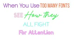
4. Keep fonts from looking too similar
The purpose of using different fonts in a design is to add visual variety. It is pointless to select two typefaces that are visually identical for this reason. In reality, the likelihood of typeface collision increases with font similarity.
5. When selecting two fonts, use decisive contrast
Make sure the typefaces you select to employ have noticeable contrasting differences when using numerous typefaces. Find the two typefaces that are very distinct but have one thing in common that would make the two different fonts gel in with each other well.</ p>
Our Popular Fonts For Neon Signs
80’s neon sign font
This thick double-line font works well for labels, posters, logos, and almost anything else that needs that vintage, retro feel.
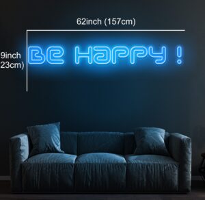
Futuristic font
Use this gentle, rounded font to create something enjoyable and futuristic right now. To assist them to soar to success, add vintage-designed neon signs & stylish logos. The font makes the neon light seems extremely crisp and aesthetically accurate because of its broken-up pipe-like design.
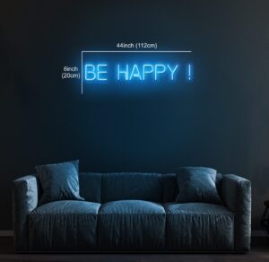
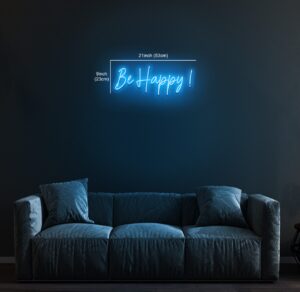
Handwritten font (best font for neon signs)
This font is one of the most popularly used fonts when designing neon signs for home décor or for gifting purposes as this sweet & flowy font gives a personalized feel. Create your own custom light art and make a unique home décor art piece in your favorite neon color. You can learn more about trendy neon colors theme.
Popular neon sign fonts for business logos & signs
Business logo signs need to look more impactful than other neon sign that are used at homes or events. Business logo neon sign font needs to match the brand’s personality so if you are someone looking to design your logo, these fonts can be for you. If your logo is
something beyond text, you can share your logo with us and we will turn it into a business neon sign.
Bold
The bold font in the logo below features larger, blockier text. As a result, they look a bit more rugged, bold, and quirky than traditional fonts. This type of font works well for companies with a long and proven history of producing quality products but still want to appear current and relevant.
Elegant
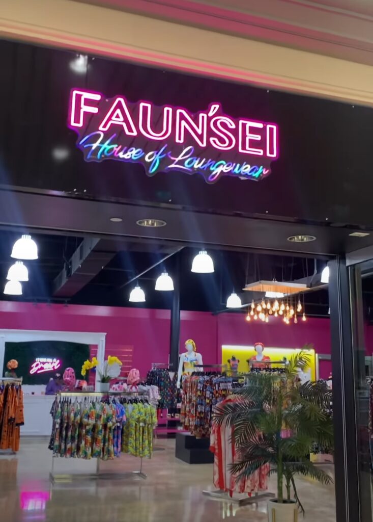
Elegant fonts designed to imitate cursive handwriting, have character strokes that connect one letter to the next. Just as everyone’s handwriting looks very unique, each script font feels very distinctive. They tend to follow the design trends of the day, making script fonts a risky choice for a brand font, as they might fall out of fashion too quickly.
 </ p>
</ p>
Informal and Artistic
Handwritten fonts are pretty self-explanatory…they’re fonts that look like they’ve been written out by hand. They sometimes incorporate weird letterforms, and they’re about as different from traditional fonts as you can get. They’re a fun choice if you want to present yourself as a playful, informal, approachable, or artistic brand, as seen in the image below.

Check
out your favorite fonts and make your life easier!
Was this guide helpful? You must have gotten a little idea on how to choose the right font for your neon sign, head to our neon sign maker tool and enter the text, choose your favorite neon color and font and see how your sign is going to look in real life. Don’t you worry, if you can’t find the font or color you want, or if it doesn’t match your existing sign or business logo, you can upload the design you want using our Create neon sign option and our team will provide you with a mockup. All you have to do is select the mockup and you will be given a price quote. It’s that convenient! Goodbye to the boring corners and say hello to the lively and bright wall décor.

